Paw Air
Goal: Develop the design concept for a fictional company.
"PawAir is the first airline for pets only. PawAir's mission is to guarantee that every pet has a safe and calm flight. Many airlines require animals to travel along with dispatched luggage or even demand that they be drugged so that other passengers aren't disturbed. PawAir is concerned with the well-being and health of every animal and ensures a stress-free flight for each pet and a life-changing experience for every owner."
The idea for the company was inspired by a personal experience moving abroad with my family dog, Polly. The airline forced us to hand her off to staff so that she could be dispatched with the luggage. Once we got to the destination, the airline staff lost her crate and she was nowhere to be found. While desperately looking for her throughout the airport we heard her bark, followed it, and found her with lost luggage.
Skills Used
- Illustrator
- InDesign
- Photoshop
- Lightroom
- Laser Cutting
Logo Design Process
My design process for the company logo consisted firstly of drawing up some general concepts on paper and a tablet. I then translated the hand-drawn draft into actual designs on Adobe Illustrator, paying attention to the scalability of the logo. For each logo draft, I made several different versions of it, testing out different colors and fonts. Once I was happy with each version, I then shifted my focus to the brand message and how the logo would convey that to viewers.
One of the most insightful and important parts of this project for me was sharing my different iterations with my professor and classmates. Even though I had my personal favorite logo, the opportunity to get constructive feedback from them improved my work and gave me a lot of insight into what the general audience would perceive.
Logo Drafts
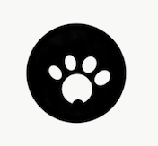
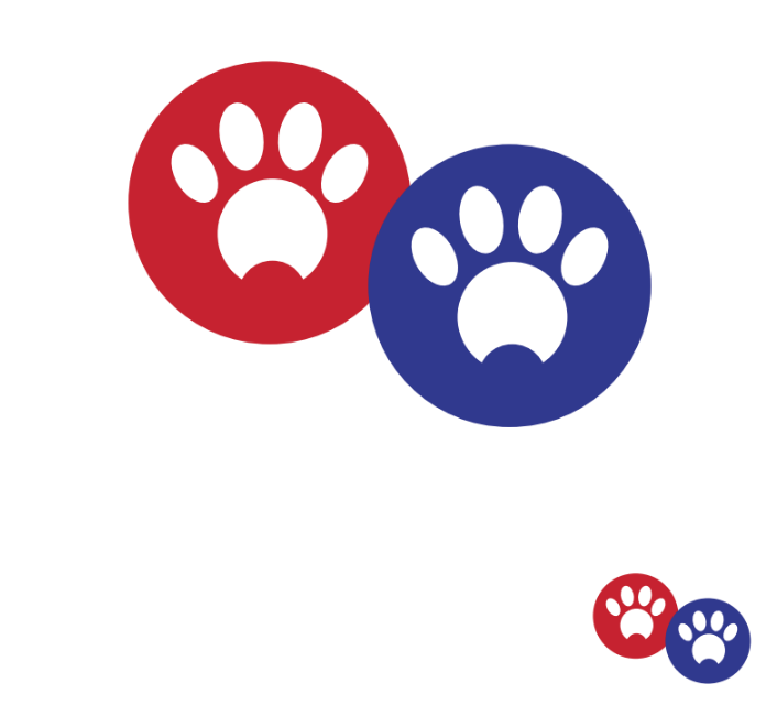
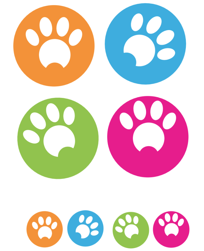
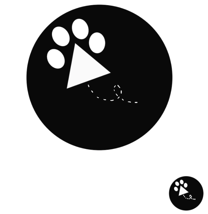
Draft 1: Started by testing out the concept of a "generic paw". I liked how the red and blue version felt like an airline logo to me, but I believe it was due to the colors alone. Once I changed the color palette it stopped feeling like an airline to me and more like a Pet Shop or Doggy Daycare.
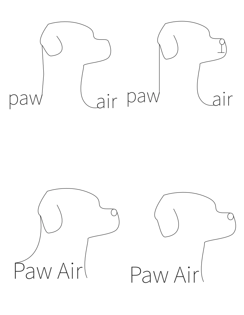
Draft 2: Tried to keep the idea of a "generic paw", but wanted to include the company name. When scaling down, I felt like the company name was not necessary. Also attempted to use the paw itself as the letter A in Airline. Still did not feel like an airline logo to both me and my classmates, but it inspired the remaining drafts and my final version.
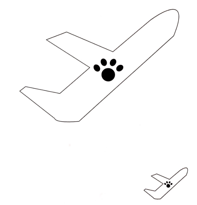
Draft 3: I played around with the idea of turning the paw itself into an airplane to make the purpose of the company more obvious, but I did not think these drafts scaled down nicely. The feedback I received was that the logo was too literal, which I agree with.
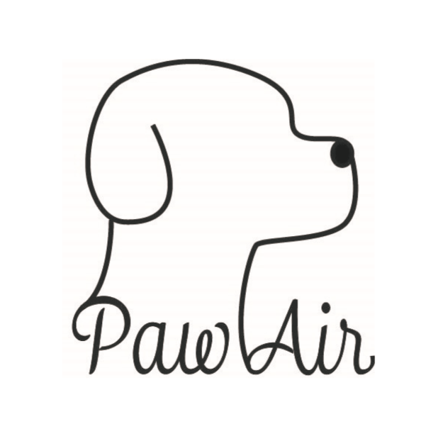
Final Logo Iteration Process
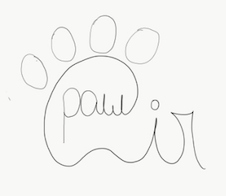
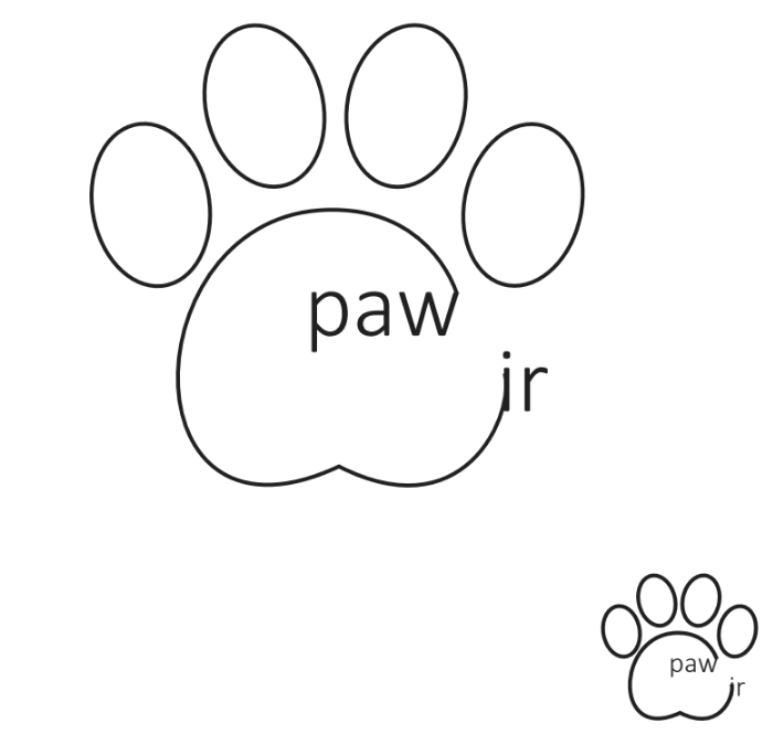
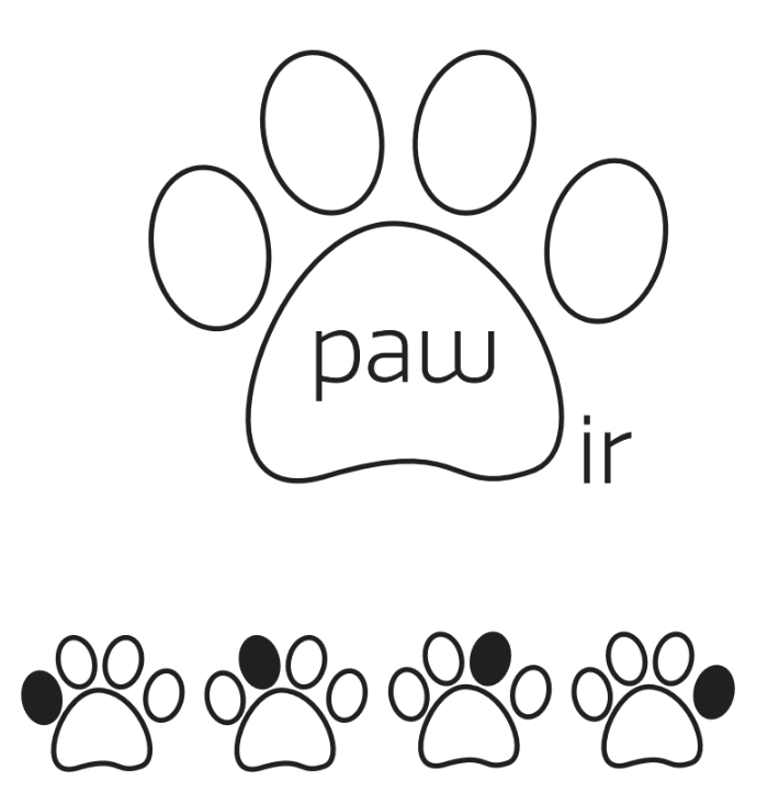
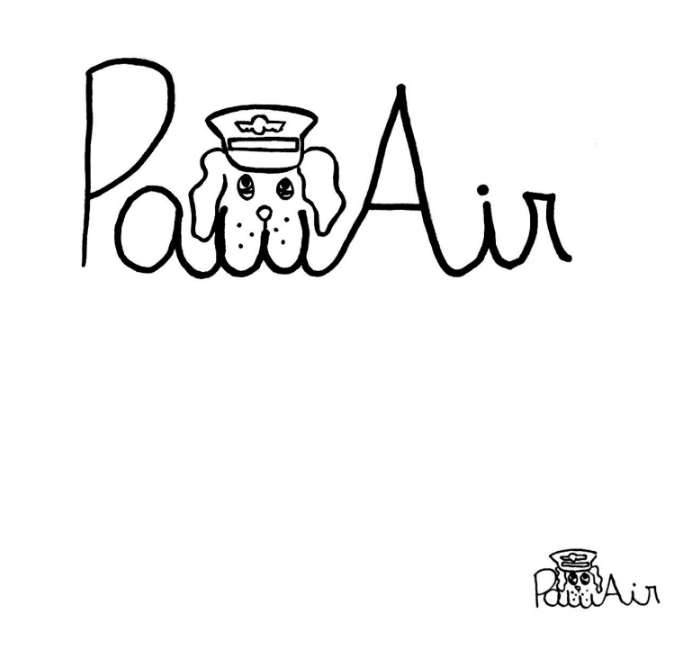
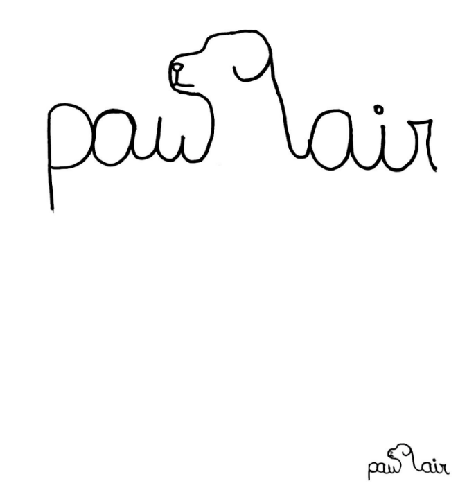
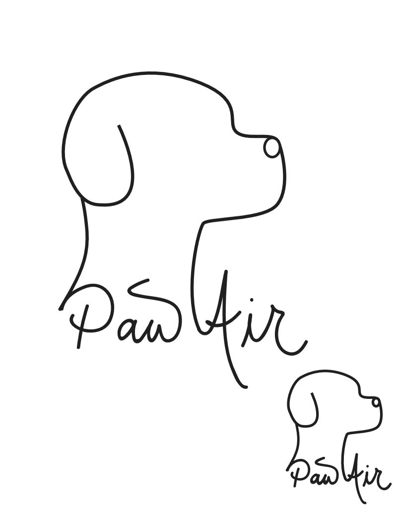
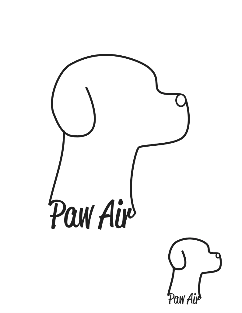
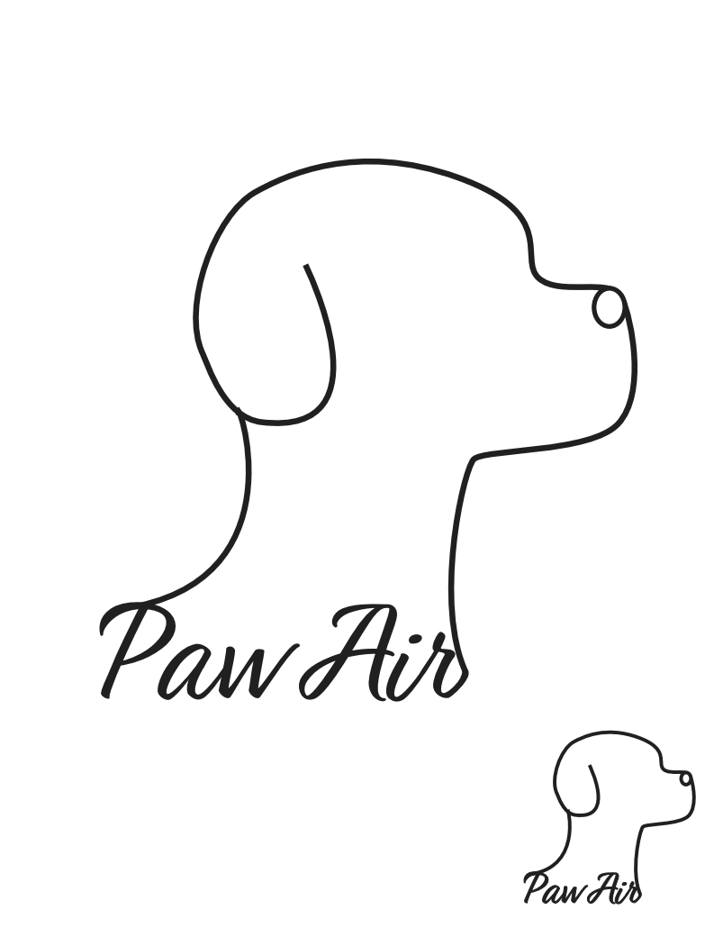
Draft 2 inspired me to play around with fonts and incorporate them into my drawings. The first dog was something I used to draw a lot as a kid so I used it as a placeholder until I figured out what I wanted the dog to look like. After a few iterations, I figured out that having the text within the drawing instead of around it made it more scalable. I wrote the company name out by hand at first and then tried to find similar fonts, but none of them looked right. I then chose a font that looked the closest to my handwriting but did a lot of editing on Illustrator to make it one with the logo.
This was my classroom's favorite logo and it was also my own mainly because of how fun it was to draw. I also believe the incorporation of the company name makes the mission apparent, but having the dog as the focus instead of a plane made sense in my mind because I wanted the focus of the company to be on taking care of the pets.
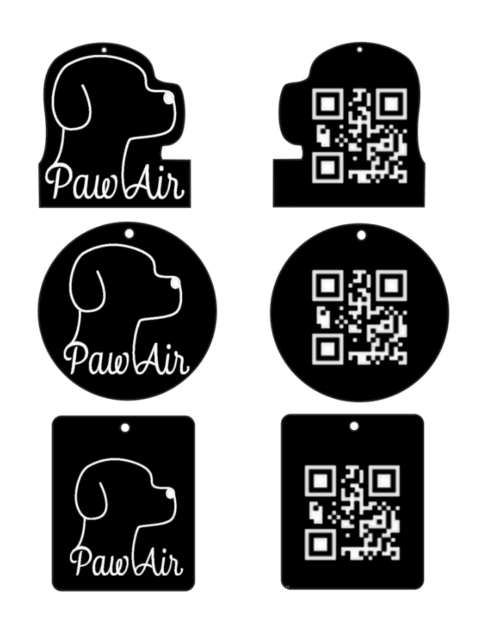
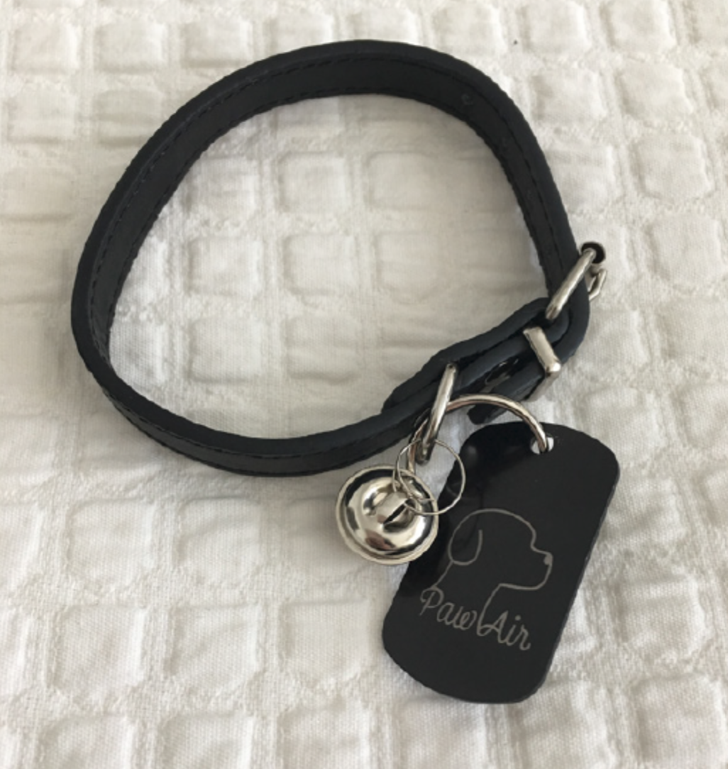
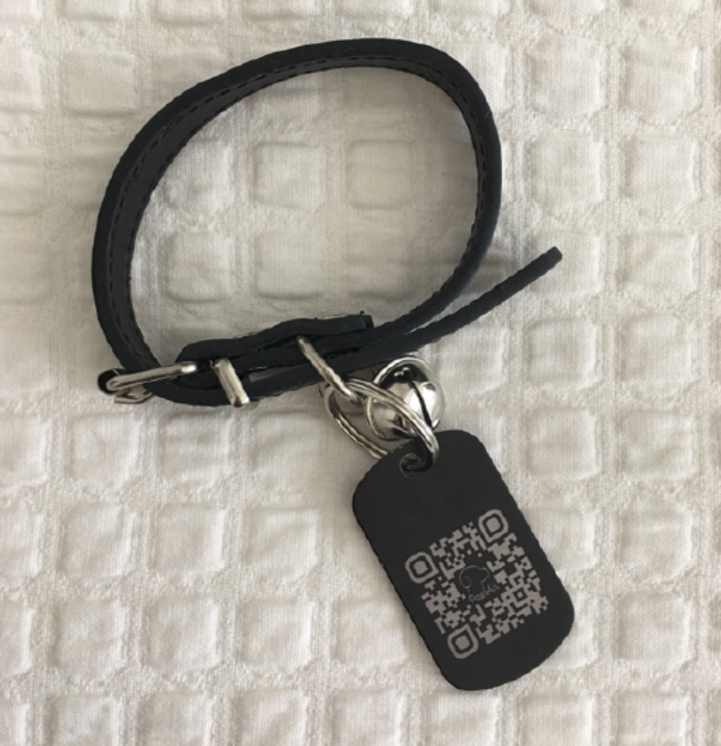
Physical Application of the Logo
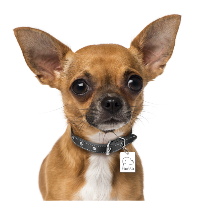
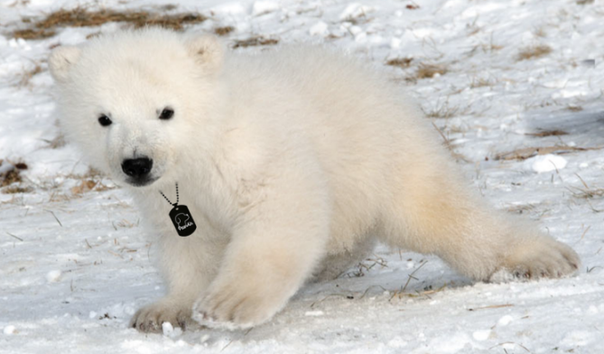
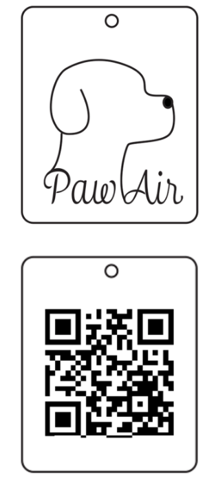
The final part of the project was to create a physical application of the logo. Since my company is a pet airline, I thought the company could benefit from each pet having a collar with a tag as an airline ticket.
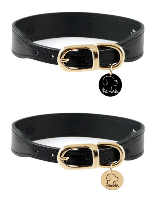
The first step was to photoshop some versions of the tags on the "pets".
The second step was to prototype on InDesign what the tag would look like.
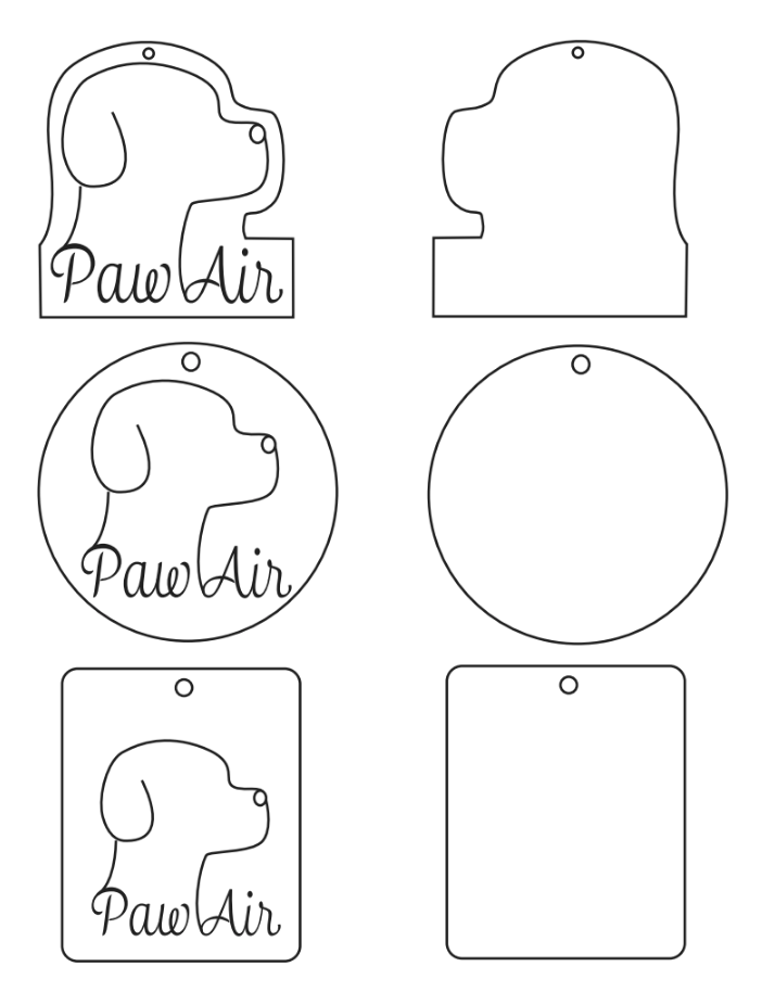
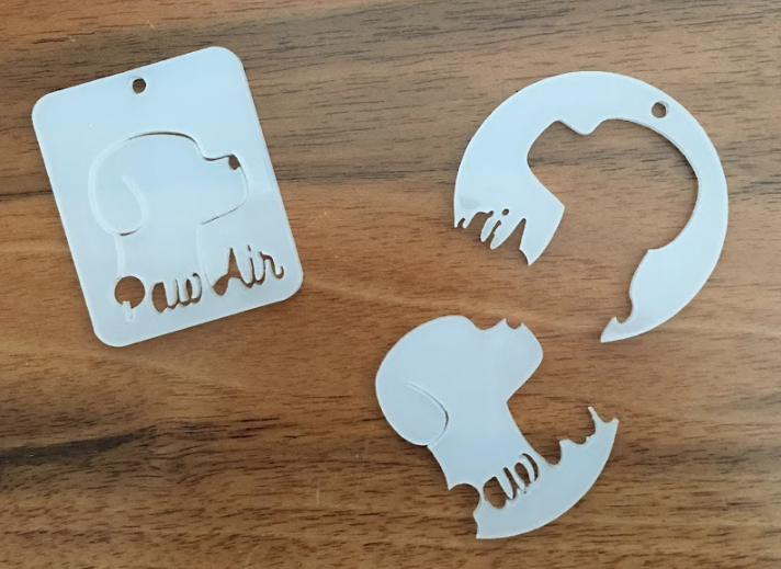
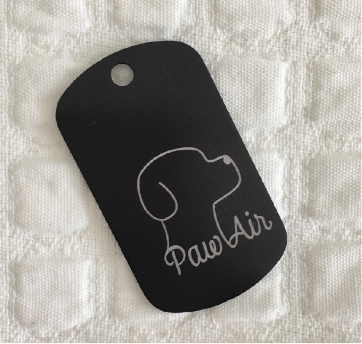
The last step was to start laser cutting and test out different materials. At first, I tried laser cutting acrylic. It ended up being way too fragile and easily broken. My alternative was to order stainless steel tags and test that out. It ended up working out perfectly and it only took me a couple of times to center the logo and QR code.o and QR code.
Interface Design | Wireframes
High-fidelity wireframes for a company website, where customers can register their pets and book flights for them.